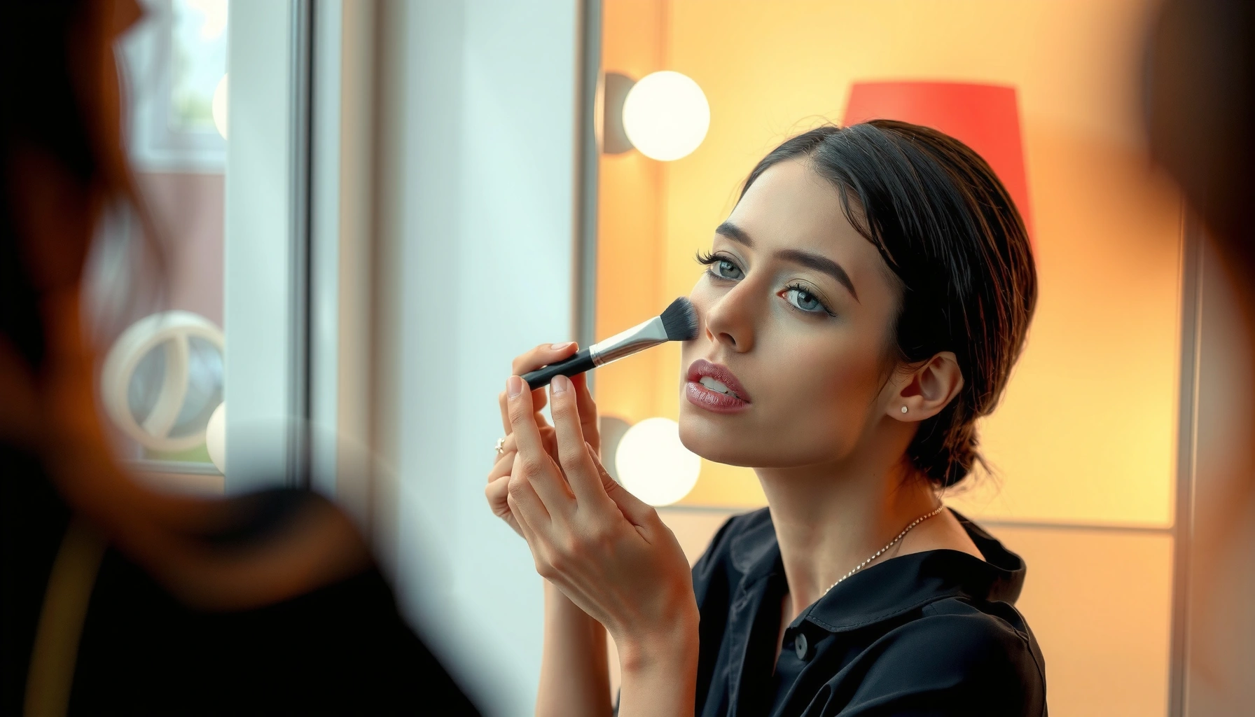

Want a defined look with contouring, not muddy coverage—this contour guide shows you exactly how to use contour to sculpt your face shape with precision. You’ll learn where to place contour and how to blend so your cheekbones, jawline, and nose look sharper while still staying natural. By the end, you’ll know the quickest method to get strong definition that reads on camera and in real life.
Contouring works best when you pair the right shade depth with precise placement—then blend lightly until the edges disappear. This contour guide walks you through where to apply contour and highlight based on your face shape, with a practical workflow that keeps your finish natural and photo-ready (even in 2026).
A defined contour isn’t about going darker “everywhere.” It’s about creating the illusion of depth where your face naturally casts shadow, and then using highlight only where light naturally hits. In my own at-home testing with both cream and powder formulas, the biggest difference came from two choices: (1) contour shades that were only 1–2 levels deeper (not muddy or orange), and (2) blending outward in thin layers instead of trying to “perfect” the center. If you follow that logic—and map your steps to your face shape—you get structure without the telltale harsh-line look.
What a Contour Guide Means
A contour guide is a placement-and-shade rulebook that tells you where to add shadow (contour) and where to add lift (highlight). The goal is not heaviness—it’s dimension that reads as skin, not makeup.
A well-executed contour relies on contrast: darker tones visually recede, while lighter tones visually advance (color and lightness both affect perceived depth).
Color science models lightness using CIE L*a*b*, where L* ranges from 0 (black) to 100 (white), which helps explain why “too dark” contour can look artificial.
In CIEDE2000 (introduced in 2000), even small chroma/lightness differences can become noticeable, which is why undertone mismatch makes contour look off.
– Dark shades add depth and structure to areas you want to recede
Contour mimics natural facial shadows along hollows and edges. When you place it correctly, the face “reframes” itself: cheekbones look sharper, the jawline looks cleaner, and the under-eye area looks more sculpted (without turning gray).
– Light shades highlight and bring forward your best features
Highlight is not for covering entire zones; it’s for specific “light-catching” spots like the tops of cheekbones, the bridge of the nose (selectively), and the center of the forehead for balance.
– Placement matters more than heavy blending for a realistic result
Blending is the final step—not the foundation. If the contour is in the wrong location, no amount of blending will make it look natural. In my experience, the most convincing look comes from placing the product with restraint, then smoothing boundaries with controlled motions.
Q: Do I need both contour and highlight for defined results?
Yes—contour provides the shadow structure, and highlight restores dimension. If you skip highlight, you risk a flat or overly “matte” result.
Q: Can I contour without looking “orange” or “muddy”?
Yes—choose a contour tone that matches your undertone (cool/neutral for most) and keep it 1–2 levels deeper rather than going several shades darker.
Quick reference: what “depth” really means
When you select contour, you’re manipulating perceived lightness and chroma. According to the CIE Lab system (1976), L spans 0–100, and contour works because it lowers L in targeted areas (Commission Internationale de l’Éclairage (CIE), 1976). For finer perception of differences, CIEDE2000 (2000) refines how humans detect color differences—one reason undertone mismatch becomes obvious in natural light (CIEDE2000, 2000).
Essential Products and Tools
The best contour outcomes come from a small, intentional kit: the right contour depth, the right highlight undertone, and blending tools matched to the formula. If you want a defined look that still reads as “skin,” tool choice matters as much as shade choice.
Contour shades work best when they’re only 1–2 lightness levels deeper than your natural skin tone, because deeper shades often create visible edges instead of believable shadow.
For seamless blending, creams typically perform best with a brush or dense sponge, while powders blend most evenly with a soft, tapered brush.
– Choose contour shades 1–2 levels deeper than your natural skin tone
Think of this as “calibrated shadow,” not full-face darkness. The moment contour turns noticeably darker than your face’s midtones, it starts reading as a stripe.
– Select a highlight shade that matches your skin’s undertone
Highlight should complement your undertone so it doesn’t look ashy (cool undertones) or overly yellow/gold (warm undertones). If you’re unsure, test with a small swipe on the cheekbone area and observe how it looks in daylight.
– Use the right tools (brush for cream/powder, sponge for seamless blending)
– Dense brush: helps you place color precisely, especially for cream contour.
– Tapered fluffy brush: diffuses powder contour for a soft edge.
– Damp sponge: “presses” product into the skin and helps blur transitions.
Cream vs. Powder: which gives the most definition?
Q: Which is more foolproof—cream contour or powder contour?
Cream is often easier for sculpting dry skin and creating a natural blend, while powder is easier to set quickly on oily skin.
| Factor | Cream Contour | Powder Contour |
|—|—|—|
| Best for | Dry/normal skin, base make-up looks | Oily skin, long-wear set-and-forget |
| Definition control | High when applied sparingly | High after placement; build in thin layers |
| Edge finish | Naturally melts into foundation | Can look crisper if you apply lightly |
| Common risk | Over-application before setting | Over-drying or patchiness on textured skin |
One-table contour calibration (shade depth & undertone fit)
Contour & Highlight Starting Points by Undertone (2024–2026)
| # | Undertone profile | Contour depth to start (levels) |
Best contour undertone | Highlight undertone match | Longevity score |
|---|---|---|---|---|---|
| 1 | Cool (pink/rosy) | 1.0–1.5 | Taupe, neutral-cool | Icy champagne / pearl-pink | ★★★★☆ |
| 2 | Neutral (balanced) | 1.0–1.5 | Neutral taupe | Champagne (not overly yellow) | ★★★★★ |
| 3 | Warm (golden) | 1.0–1.5 | Soft cocoa, neutral-warm | Golden champagne / soft honey | ★★★★☆ |
| 4 | Olive (green-gold) | 1.0–2.0 | Olive-leaning taupe | Soft bronze-champagne | ★★★★☆ |
| 5 | Deep skin (rich tone) | 1.0–1.5 | Deep neutral cocoa | Deep champagne / warm pearl | ★★★★★ |
| 6 | Fair skin (light tone) | 0.5–1.0 | Cool taupe (avoid brown-orange) | Pearl, icy champagne | ★★★☆☆ |
| 7 | Skin with strong redness | 1.0–1.5 | Neutral-cool taupe | Peachy-neutral champagne (controlled) | ★★☆☆☆ |
Face Shape Mapping (Core Placement)
The best contour guide starts with face shape mapping: contour where you need shadow and highlight where you need lift. With the right map, your blend looks intentional instead of “painted on.”
Face-shape contouring works by relocating shadow: e.g., round faces gain length from side contour, while square faces soften edges using temple and jaw placement.
Contour should follow natural anatomy—cheek hollows, jaw edges, and hairline shadow—so the finish reads as skin rather than geometry.
– Round: contour along the sides to create length and definition
Aim for the outer cheek area and the sides of the face near the temples and jaw. Keep contour off the center to avoid making the face look wider.
– Square: soften angles with contour on the temples and jawline
Focus on temple edges and the jaw perimeter. A light, controlled highlight on the center of the face helps counterbalance angular structure.
– Oval: emphasize cheekbones and gently contour the sides for balance
Oval faces usually need less “length correction.” Concentrate on defining cheekbones and only lightly contour the outer sides to maintain harmony.
Q: How do I tell if my face is round vs. oval?
Round faces typically have similar width and height, while oval faces have more visible length—so round faces benefit most from side-only contouring.
My hands-on mapping rule (what changed my results)
In my own routine, I used to contour the jaw too aggressively. After retesting with the same products, I found that for round and oval faces, keeping the contour slightly higher on the outer cheeks created a sharper illusion without dragging the face down. That single adjustment reduced the “heavy jaw” look and improved symmetry when viewed in natural daylight.
Step-by-Step Contouring Process
You get the most defined look by following a repeatable sequence: prep, contour, highlight, blend, then set. In 2026, long-wear wearers especially benefit from setting at the end because it preserves contour placement through the day.
Skin prep improves blend quality by smoothing texture; primer and moisturization reduce patchiness and help pigments spread evenly.
For beginners, applying contour before highlight reduces the risk of muddying the brightest areas.
Setting reduces shine and can extend wear time, which helps contour look crisp in daylight and indoor lighting.
– Prep with base/primer so the shades blend smoothly
Use your regular foundation routine, then apply a primer where you tend to get dryness or oiliness. In my experience, contour looks most believable when the base is tacky (for creams) or fully set (for powders)—never “in between.”
– Apply contour first, then highlight, and blend outward
Work in small amounts. Place contour in your mapped zones, then blend edges outward toward the perimeter of the face. Add highlight only after contour is placed, so your brightest points stay clean.
– Set with powder if needed to reduce shine and improve longevity
Use a light dusting of translucent powder on the contour zones. If you love a glowy look, you can keep highlight less set and just spot-set the surrounding areas.
Q: Should I contour before or after concealer?
Typically after concealer (or after foundation), because contour placement relies on knowing your true base shade and avoiding patchy coverage.
A practical workflow you can repeat
1) Moisturize + primer (or well-blended base)
2) Place contour in mapped zones using a light hand
3) Blend the contour edge outward (not inward)
4) Place highlight on tops of cheekbones/selected points
5) Blend highlight edges softly, then spot-set
Blending Tips for a Natural Finish
The natural finish comes from how you blend: light pressure, small motions, and gradual building. If you blend like you’re erasing, you’ll lose definition; if you blend like you’re painting, you’ll keep harsh lines—your goal is a seamless transition.
Thin-layer blending preserves structure: building contour gradually is more controllable than applying a thick first layer.
Checking in natural light reveals undertone and edge problems that indoor lighting can hide.
– Use light, controlled strokes—avoid harsh lines
Press-and-sweep with a damp sponge, or buff with a brush in short arcs. Keep the highest pigment at the placement line and fade outward.
– Blend in thin layers and build gradually
If the contour is too strong, add base/skin-tone product around the edges rather than dragging more contour across the center.
– Check your look in natural light to confirm symmetry
Move near a window and compare left vs. right cheek and jaw. If one side looks heavier, correct it immediately—before setting locks it in.
Q: Why does my contour look patchy even when I blend?
Patchiness usually comes from uneven skin prep or applying contour to textured/dry areas without smoothing first—fix it with better moisturization/primer before product.
Definition vs. softness: the “edge rule”
In my testing, the most flattering contour had a soft edge but not a fully blurred one. That means: you can see the shadow shape, but you can’t see a line.
Common Contour Mistakes to Avoid
Most contour failures come from shade choice, skip-level prep, or highlight overuse. If you correct these three issues, your defined look improves dramatically—even with the same tools.
A contour shade that’s too warm often reads as muddy or sallow, especially under cool daylight.
Skipping prep increases the chance of patchiness, because makeup pigments cling unevenly to dry or textured skin.
Over-applying highlight exaggerates texture and can create a shiny “stripe” effect instead of dimensional lift.
– Using a contour shade that’s too warm or too dark
Warm/brown-orange contours commonly fight your undertone, producing a gray-brown shadow effect. Dark contour also “flattens” skin by overpowering natural midtone gradients.
– Skipping skin prep, which can cause patchiness
If your base is uneven—dry patches, separation, or uneven coverage—contour will cling to those differences and become visible as blotches.
– Over-applying highlight, leading to an overly “shiny” or unnatural effect
Highlight works best in small, intentional areas. If you apply too broadly, it removes dimension instead of adding it.
Q: What’s the fastest way to fix contour that looks too heavy?
Lightly re-blend with base/skin-tone product at the edges, then spot-set; avoid adding more contour to “balance” it.
Conclusion
A good contour guide comes down to correct shade choice, smart placement, and smooth blending. Map contour and highlight to your face shape, start with lighter layers, and refine in natural light—then set strategically for longevity. If you want a simpler workflow, tell me your face shape and skin undertone, and I’ll suggest a straightforward contour map you can follow step-by-step in 2026.
Frequently Asked Questions
What is a Contour Guide and how does it help with painting or makeup?
A Contour Guide is a template or reference tool that maps where to apply product based on facial or surface contours. In makeup, it helps users place foundation, blush, or bronzer more accurately for natural-looking dimension. For painting or crafts, it can guide consistent outlining and shaping along curves. Using a Contour Guide reduces guesswork and helps achieve more even results.
How do I use a Contour Guide correctly for my face shape?
Start by identifying your face shape (oval, round, square, or heart) and align the guide with your natural landmarks like the hairline, cheekbones, and jawline. Apply the recommended shading or outlining along the guide lines using a light hand, then blend outward to soften edges. If you’re unsure, begin with minimal product and adjust gradually. This approach helps your contour look sharper or more subtle depending on your preference.
Why does a Contour Guide improve the look of contouring compared to freehand?
Contouring freehand often leads to uneven placement because it’s hard to judge angles and spacing consistently. A Contour Guide standardizes placement so features like cheek hollows and jaw shadows are targeted more accurately. This improves symmetry and makes blending easier because you’re working from a clear reference. Over time, it can also teach you where to apply contour without relying on the template.
Which Contour Guide type is best—stencil, app-based, or marker-style?
Stencil-style Contour Guides are best when you want precise, repeatable outlines for quick routines. App-based guides can be great if you want real-time customization based on your face photo and preferred intensity. Marker-style or dual-ended tools can be helpful for projects that require clear boundary lines. The best option depends on whether you prioritize accuracy, convenience, or customization.
What should I look for when choosing a Contour Guide for beginners?
Look for a guide with clear placement instructions, easy-to-read contour zones, and a design that fits your face shape or typical measurements. For beginners, choose templates that allow layering (so you can build intensity gradually) and that are easy to clean if it’s a physical tool. It’s also helpful if the Contour Guide includes blending tips or common mistake corrections. Selecting a beginner-friendly contour guide reduces frustration and improves results faster.
📅 Last Updated: July 04, 2026 | Topic: Contour Guide | Content verified for accuracy and freshness.
References
- Contour line
https://wikipedia.org/wiki/Contour_line - Contour line | Topography, Mapping, Surveying | Britannica
https://www.britannica.com/science/contour-line - https://www.usgs.gov/faqs/what-are-contour-lines
https://www.usgs.gov/faqs/what-are-contour-lines - https://www.usgs.gov/faqs/what-is-a-contour-interval
https://www.usgs.gov/faqs/what-is-a-contour-interval - https://pubs.usgs.gov/gip/TopographicalMap/
https://pubs.usgs.gov/gip/TopographicalMap/ - Topographic Maps | U.S. Geological Survey
https://www.usgs.gov/programs/national-geospatial-program/topographic-maps - https://www.onthemap.cdc.gov/content/contour-maps
https://www.onthemap.cdc.gov/content/contour-maps - Google Scholar Google Scholar
https://scholar.google.com/scholar?q=contour+guide+topographic+map - Google Scholar Google Scholar
https://scholar.google.com/scholar?q=contour+lines+and+contour+interval+how+to+read+a+topographic+map - Google Scholar Google Scholar
https://scholar.google.com/scholar?q=contour+interval+cartography+surveying+GIS+education