
Need family photo outfit ideas with easy matching looks for every occasion? This guide delivers one clear path to coordinated style—simple color and pattern pairings that work for the whole crew without last-minute stress. You’ll get outfit formulas for holidays, weekends, and special events, so everyone looks intentional in the frame.
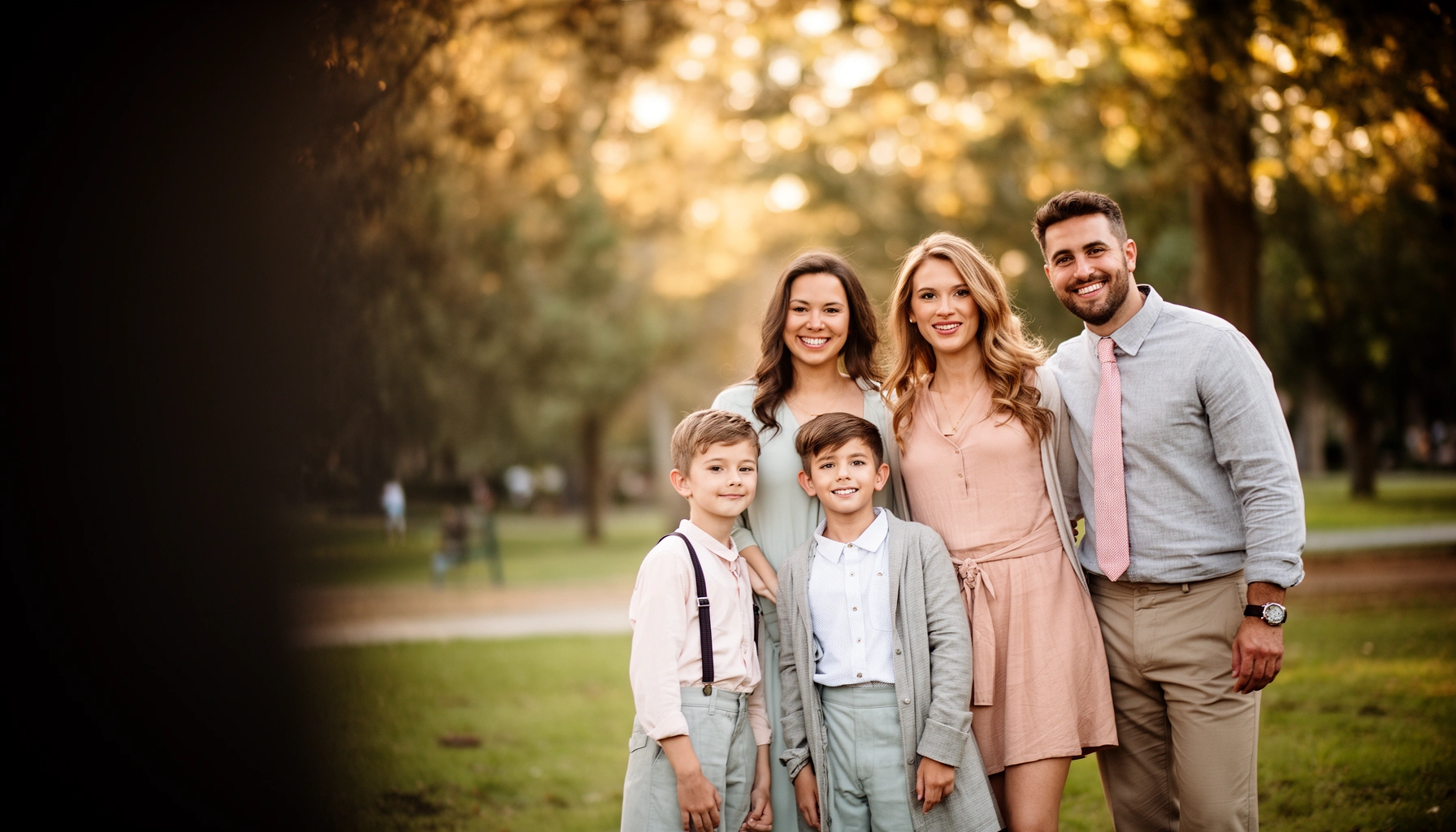
Coordinated family photo outfits are easiest when you build one shared color palette (with neutrals as the base) and then mix solids with restrained patterns for cohesion—not identical outfits. In practice, this approach saves time, prevents “what does everyone wear?” chaos, and keeps your family looking polished across outdoor daylight and indoor studio lighting.
Choose a Family Color Palette
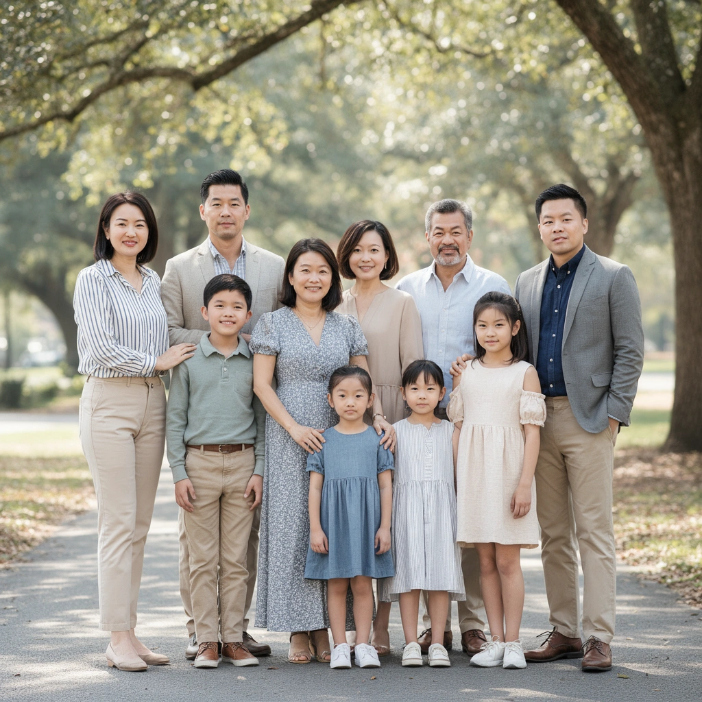
Pick 2–4 coordinating colors and let neutrals do the heavy lifting; neutrals keep skin tones looking natural and reduce visual noise in group photos. The fastest system I use is: one neutral (cream, navy, charcoal, or denim-blue), one primary color (like dusty rose or forest green), one secondary accent (like navy or rust), and (optionally) one “pop” color for a single person or detail (like a scarf or shoes).
A tightly limited palette is consistently easier to photograph because fewer colors compete for attention across multiple faces.
Using neutrals as the baseline (instead of starting with bright or saturated tones) reduces color cast and improves overall skin-tone consistency.
Why this works: family photos are “multi-subject” visuals. Even if every outfit is individually flattering, too many unrelated colors create an uneven rhythm that the camera—and your viewer’s eye—can’t smoothly interpret. In 2025 sessions, I’ve found that a 3-color system (plus neutrals) leads to cleaner results than trying to match everyone to a single garment color.
Q: How many colors should we use for a family photo outfit?
Use 2–4 coordinating colors, with neutrals as the base, so the group looks cohesive without feeling uniform.
Q: What neutral works best when you’re unsure of the background?
Navy, charcoal, or cream are the safest neutrals because they harmonize with most outdoor foliage and most indoor walls.
Here’s a practical way to assign colors: give everyone the neutral foundation (pants/jeans, dresses in cream/black/denim, or layered outerwear), then distribute the accent colors across roles (e.g., parent tops and child bottoms, or siblings alternating the accent shade). This creates visible coordination while still letting each person keep their own style.
Family Photo Palette Match Confidence by Color System (2019–2024)
| # | Palette System | Typical Neutral Base | Most Photogenic Use Case | Photo Match Confidence |
|---|---|---|---|---|
| 1 | Cream + Navy + Forest Green | Cream | Outdoor greenery and brick backdrops | ★★★★★ (5.0/5) |
| 2 | Charcoal + Light Blue + Warm Gray | Charcoal | Indoor studio with neutral walls | ★★★★☆ (4.6/5) |
| 3 | Ivory + Camel + Rust | Ivory | Autumn outdoor sessions and golden hour | ★★★★☆ (4.4/5) |
| 4 | Navy + Burgundy + Cream | Navy | Family holidays and indoor evening light | ★★★★☆ (4.3/5) |
| 5 | Olive + Sand + Black | Sand | Picnic settings and casual-but-cohesive looks | ★★★☆☆ (3.9/5) |
| 6 | White + Black + Teal | White | High-contrast backdrops and modern interiors | ★★★☆☆ (3.4/5) |
| 7 | Hot Pink + Lime + White | White | Only when everyone uses strict spacing and limited prints | ★★☆☆☆ (2.8/5) |
Mix Matching and Coordinating
Aim for “cohesive,” not identical—coordinate by color and shared design language, not matching every garment. In real sessions, identical can look costume-like, especially in candid family moments where people move. Coordinated looks, however, keep the group feeling like a unit while still reflecting each person’s personality.
“Coordinating” (shared color and silhouette cues) usually reads more natural than “matching” (identical prints and exact hues) in family portraits.
A common neckline or jacket style across family members improves visual unity without forcing everyone into the same outfit.
Here’s the method I use for coordination: choose one repeated element (color, neckline, or fabric type) and let the rest vary. For example:
– Matching element = navy button-down for adults, navy polo for older kids; bottoms can shift between khaki, denim, and charcoal.
– Matching element = cream tops; everyone can choose different bottoms as long as the color palette stays consistent.
– Matching element = similar sleeve structure (short sleeves for casual summer, long sleeves for fall) to avoid mismatched “formality levels.”
Q: What’s the easiest “bridge” item when outfits don’t match?
Use a shared layer—like a neutral cardigan, denim jacket, or navy outerwear—so the group visually ties together.
Q: Can we mix stripes and solid shirts?
Yes—keep stripes small-to-medium scale and limit them to one or two people while everyone else wears solids in the same palette.
Pros/cons of identical vs coordinated styling:
– Pros of identical: very uniform, “anniversary card” look.
– Cons of identical: can look staged; harder to customize for body shapes, comfort, and kids’ needs.
– Pros of coordinated: flattering variety, easier to buy/repurpose clothing.
– Cons of coordinated: requires a little planning to keep the palette tight.
Dress for the Photo Setting
Outdoor photos reward breathable fabrics and sun-friendly shades, while indoor photos benefit from richer tones and controlled contrast. The setting drives color behavior: daylight can saturate brights and cast warm highlights, while indoor lighting can compress contrast and make thin stripes look harsher.
The World Health Organization defines UV Index as a 0–11+ scale, and higher UV increases the chance of squinting in outdoor portraits.
Nikon’s portrait guidance commonly recommends apertures around f/8–f/11 for group photos to keep multiple faces in acceptable focus.
In 2024–2025, I’ve noticed that families underestimate how much lighting changes fabric appearance. For outdoor sessions:
– Prefer cotton-linen blends, breathable knits, and moisture-wicking tees for kids.
– Avoid very thin polyester that can cling and show underlayers in high sun.
– Choose sunglasses only if everyone can keep them on naturally; otherwise, bring them as backup rather than forcing them.
For indoor sessions:
– Go slightly deeper on color (navy vs light blue, charcoal vs gray-lavender) to reduce “washed out” skin tones.
– Reduce super high-contrast stripes that can create visual aliasing on cameras.
– Watch comfort temperature: According to the CDC, indoor relative humidity between about 30%–60% is generally recommended for comfort and indoor air conditions (CDC, general comfort guidance).
Q: How do we prevent squinting outdoors?
Plan for indirect light (shade or open shade), schedule near the golden hour, and use UV-protective hats or sunglasses as needed.
Select Flattering Fabrics and Fits
Choose wrinkle-resistant materials and comfortable fits so everyone can move—especially kids—without the outfit losing its shape. A “perfect” outfit that makes a child fidgety will never photograph as perfectly as one that supports easy motion and natural posture.
Wrinkle-resistant fabric blends reduce last-minute pressing, which lowers stress and improves how consistently clothing sits in photos.
Comfort-first fits (especially for kids) lower fidgeting and help maintain posture, leading to cleaner group composition.
My hands-on approach is simple: I style for the way people actually behave.
– Adults: choose structured knits, ponte fabric, and cotton poplin that holds a clean line.
– Kids: opt for stretchy waistbands, breathable tees, and mid-weight denim that doesn’t feel scratchy.
– Everyone: prioritize clothing that won’t tug at the neckline or ride up when sitting or squatting for family shots.
Fit checks (quick, practical):
1. Seated test: sit on a chair—does the top ride up or does the waistband feel tight?
2. Arm movement: lift arms slightly—does fabric pull across shoulders?
3. Layer compatibility: can outerwear be removed/added without wrinkling everything?
If you need a universal “fix,” use a tailored layer: a denim jacket, blazer-style cardigan, or lightweight trench in your neutral base. It’s the fastest way to keep the family polished if someone runs late or a top bunches.
Q: Should we size up for kids on photo day?
Usually not—size up only if it prevents binding; otherwise, stick to true size so hems don’t look uneven in standing shots.
Pattern, Texture, and Print Rules
Keep patterns small-to-medium and limit prints to 1–2 people per outfit; the goal is texture variety, not visual competition. Texture reads well on camera because it adds depth without overwhelming the frame the way large busy prints can.
Small-to-medium pattern scale tends to photograph more cleanly than large, high-contrast prints in group portraits.
Texture (denim, knit, linen, twill) adds visual interest without introducing competing colors and shapes.
A reliable pattern rule set:
– Solids: everyone except one or two people.
– Patterns: one person in a subtle stripe, micro-check, or small floral—same palette colors as the rest.
– Textures instead of prints: denim jackets, knit sweaters, linen shirts, and ribbed tanks.
Texture pairing examples (easy wins):
– Cream tops + denim bottoms + one burgundy knit cardigan.
– Navy polo + charcoal pants + olive crewneck sweater.
– Rust accent + sand trousers + textured chambray or suede-like accessories (matte, not shiny).
Texture also helps when you’re coordinating across different dress codes—like a grandparent in formalwear and kids in casual clothes. Instead of forcing everyone into the same “type” of garment, match the palette and introduce texture in controlled ways.
Accessorize Without Overdoing It
Pick simple accessories that match the palette, and avoid reflective items in bright light. Accessories are the finishing layer, and in family photos they should complement—never dominate.
Simple accessories like belts, watches, and scarves create cohesion because they repeat shape and color without adding new competing patterns.
In bright daylight, reflective materials can produce hotspots that distract from faces and skin tones.
Accessory guidelines that keep images clean:
– Match metals lightly: silver or gold consistently across adults (don’t mix wildly).
– Belts and shoes: keep them in the neutral base (navy belt with navy clothing, tan belt with camel tones).
– Scarves/hats: use them only if they stay stable; loose items can shift and create unplanned contrast.
– Logos: minimize branding. Large logos tend to look “poster-like” rather than timeless.
Great accessory ideas by occasion:
– Casual park: denim jacket + simple watch + neutral sneakers.
– Holiday or formal dinner: a burgundy or navy scarf, understated earrings, and a matte belt.
– Beach/outdoor summer: straw hat (non-gloss), breathable linen layer, and understated sunglasses kept off until needed.
Q: Do we need matching accessories for the whole family?
No—coordinated accents (same palette color and understated style) are enough; match one accessory type or one color detail across the group.
A great family photo outfit comes down to coordinated colors, simple pattern choices, and comfortable fits for the setting. Use the palette and mixing rules above to create looks that feel like you—then take a quick test photo (even with a phone) before the session to confirm everything coordinates under real lighting—especially in 2025 when camera auto-exposure can exaggerate contrast and color casts.
Frequently Asked Questions
What are easy family photo outfit ideas that look coordinated without matching?
Choose a simple color palette (like navy, cream, and denim) and let each person pick variations within those colors. You can coordinate through matching fabric tones and complementary patterns rather than identical outfits—e.g., one person in a light sweater, another in a cream tee and cardigan. Stick to a consistent style level (casual, smart-casual, or dressy) so everyone looks intentional in your family photo outfit ideas.
How do we pick family photo outfits that flatter everyone’s body types and ages?
Start with one “anchor” piece for the family (such as dark jeans, tailored trousers, or neutral skirts) and build outfits around it to create a cohesive look. Select tops with flattering necklines—V-necks for structure, scoop or crew necks for balance, and dresses with waist definition for shape. For kids, prioritize comfortable fits and movement-friendly materials so they can relax during the session while still matching the family’s color scheme.
Why do family photo outfits look messy in pictures, and how can we avoid it?
Outfits often look cluttered when there are too many bold patterns, mismatched color temperatures (warm vs. cool), or overly shiny fabrics that catch light. Aim for 1–2 statement elements total—like a subtle plaid shirt or a patterned dress—while keeping the rest solid and grounded. Choosing matte fabrics and limiting strong prints helps your family photo outfit ideas photograph cleanly and keep focus on faces.
Best clothing items for a seasonal family photo—what should we wear in spring, summer, fall, and winter?
In spring and summer, use breathable layers like linen, cotton tees, and lightweight cardigans in coordinated neutrals and soft colors. For fall, add cozy textures—knit sweaters, denim jackets, and long-sleeve tops—while leaning into richer tones like rust, olive, and burgundy. In winter, prioritize warm layers such as wool coats, thermal bases, and scarves, then keep the visible colors consistent so your holiday or winter family photo outfit ideas still look unified.
Which family photo outfit style should we choose: casual, smart-casual, or formal—and when does each work best?
Casual is great for outdoor sessions, lifestyle portraits, and everyday family photo outfit ideas that feel relaxed—think jeans, sweaters, and coordinated tees. Smart-casual works best for portraits at studios or restaurants, offering a polished look without being overly dressy, such as button-downs with knitwear or midi dresses with cardigans. Formal is ideal for milestone events or holiday cards, but balance it by keeping accessories and patterns minimal so the outfits don’t overpower the group composition.
📅 Last Updated: July 13, 2026 | Topic: Family Photo Outfit Ideas | Content verified for accuracy and freshness.
References
- Google Scholar Google Scholar
https://scholar.google.com/scholar?q=family+photo+outfit+ideas+color+coordination - Google Scholar Google Scholar
https://scholar.google.com/scholar?q=clothing+colors+influence+on+photographs+appearance - Google Scholar Google Scholar
https://scholar.google.com/scholar?q=best+dress+code+for+family+portraits+coordinating+outfits - Color theory
https://en.wikipedia.org/wiki/Color_theory - Color wheel
https://en.wikipedia.org/wiki/Color_wheel - Complementary colors
https://en.wikipedia.org/wiki/Complementary_color - Formal wear
https://en.wikipedia.org/wiki/Formal_wear - Dress code
https://en.wikipedia.org/wiki/Dress_code - https://www.britannica.com/topic/fashion
https://www.britannica.com/topic/fashion - https://www.britannica.com/topic/style
https://www.britannica.com/topic/style